How to Track Performance with Droplet Graphs
Last verified 22 Jun 2026
DigitalOcean Droplets are Linux-based virtual machines (VMs) that run on top of virtualized hardware. Each Droplet you create is a new server you can use, either standalone or as part of a larger, cloud-based infrastructure.
Droplet graphs are up-to-the-minute visualizations of how your server is performing over time. They let you monitor Droplet performance metrics on the Insights tab in the control panel.
Droplets come with some graphs available by default, and there are additional graphs available when the DigitalOcean metrics agent is installed. The metrics agent also enables DigitalOcean Monitoring and alert policies.
Default Droplet Graphs
To view a Droplet’s graphs, click its name on the Droplets page, then click the Insights tab. By default, three graphs are available for any Droplet:
-
The Bandwidth public chart displays public bandwidth usage in megabits per second. Incoming bandwidth is one color and outgoing bandwidth is another.
-
The Disk I/O chart displays disk read and write operations in megabytes per second, with read and write called out separately in the legend.
-
The Disk Usage chart shows the percentage of space being used on the Droplet’s disk.
The times in these graphs are in your local time zone, as determined by your browser.
If you have enabled private networking on the Droplet, you also have access to a Bandwidth private chart that displays VPC network bandwidth usage.
Metrics Agent
The default Droplet graphs use metrics collected by external tools; they require no additional services on the Droplet itself. You can enable additional metrics graphs and alerting with the DigitalOcean metrics agent, which is a small utility that runs on the Droplet.
The Improved Metrics and monitoring checkbox on the Droplet create page is enabled by default and installs the metrics agent automatically when you provision a Droplet. If you disabled this option at create time or manage an older Droplet, you can install the metrics agent later.
Once the agent is installed, the following additional graphs are available on the Insights tab:
-
The CPU chart shows the percent of total processing power being used, with distinct colors for user and system processes in the legend.
-
The Load Average chart measures whether the CPU is keeping up with queued processes. There are three lines representing 1-, 5-, and 15-minute load average calculation time frames. For definitions, see load average in the metrics reference.
-
The Memory chart displays the percentage of physical RAM in use.
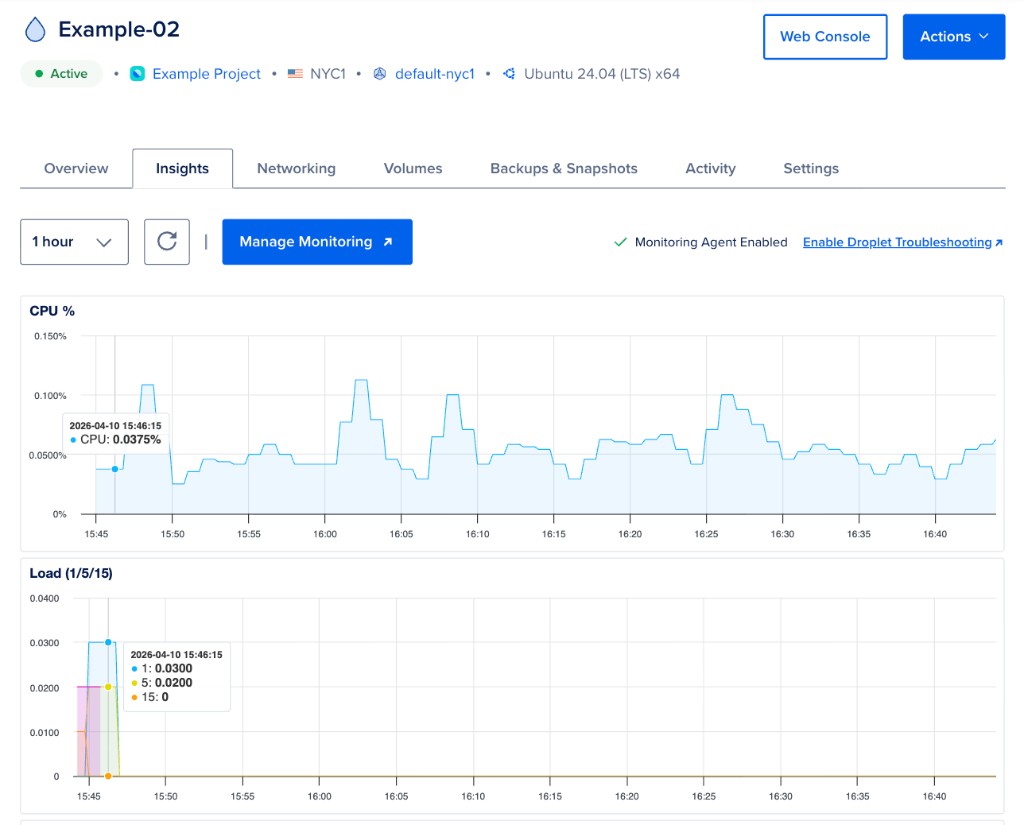
The Droplet graph time frame options include 1 hour, 6 hours, 24 hours, 7 days, and 14 days. Data resolution is based on number of points, with a fixed number of points per plot. When you mouse over any of the graphs, a line appears on all of them, pinpointing a moment in time. A graph legend appears along with metrics for that specific point in time.
Retrieve Performance Data via API
The DigitalOcean API provides monitoring endpoints that cover various performance metrics, like bandwidth, CPU, and memory usage. The following code examples cover CPU usage.
To learn more, see the monitoring endpoint of the DigitalOcean API.